
A case study on redesigning Figma's dev mode feature!
For Kleiner Perkins Design Challenge.
A case study on redesigning Figma's dev mode feature!
For Kleiner Perkins Design Challenge.
A case study on redesigning Figma's dev mode feature!
For Kleiner Perkins Design Challenge.
A case study on redesigning Figma's dev mode feature!
For Kleiner Perkins Design Challenge.
A case study on redesigning Figma's dev mode feature!
For Kleiner Perkins Design Challenge.
A case study on redesigning Figma's dev mode feature!
For Kleiner Perkins Design Challenge.
A case study on redesigning Figma's dev mode feature!
For Kleiner Perkins Design Challenge.
A case study on redesigning Figma's dev mode feature!
For Kleiner Perkins Design Challenge.


LVXYQVLIOZARQHZLYFMIHO
JRDNGDLSETRWCUIOOIJNBT
NYDIINPZFUZZLJVBMWJKTQ
QPHBDIAFYOQHXCZHKOXXPT
QBZVALOJZFUFHPRUVNZGGH
AQDPNSSARYELDXUWCZAZYX
DFLHCWWEYEDZRMDIFUASRG
Duration
7 days
Duration
7 days
Team
Individual!
Team
Individual!
Role
UI/UX Designer
UX Researcher
Role
UI/UX Designer
UX Researcher
Tools
Figma (fitting!)
Fig Jam
Notion
Tools
Figma (fitting!)
Fig Jam
Notion
AN INTRODUCTION
My Experience (I love RiceApps)
Meet RiceApps: the premier software development club at Rice University! Building projects for Rice students and non-profit organizations in Houston, we work in incredible teams of developers, a project manager, and a designer. RiceApps is…. dare I say… one of my favorite clubs on campus.
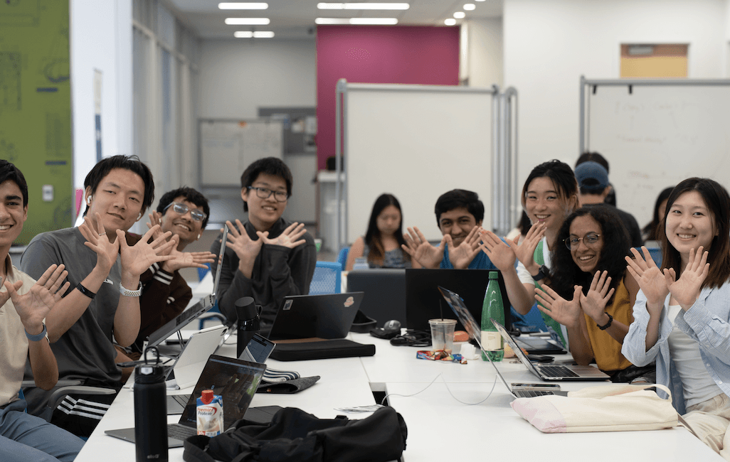
RiceApps AT HARD WORK (they’re coding, I promise)!!!!!
RiceApps AT HARD WORK (they’re coding, I promise)!!!!!
RiceApps AT HARD WORK (they’re coding, I promise)!!!!!
RiceApps AT HARD WORK (they’re coding, I promise)!!!!!
Members of our RiceApps’ OSA (Open Source Accelerator) Program, where we teach new programmers web development fundamentals.
Members of our RiceApps’ OSA (Open Source Accelerator) Program, where we teach new programmers web development fundamentals.
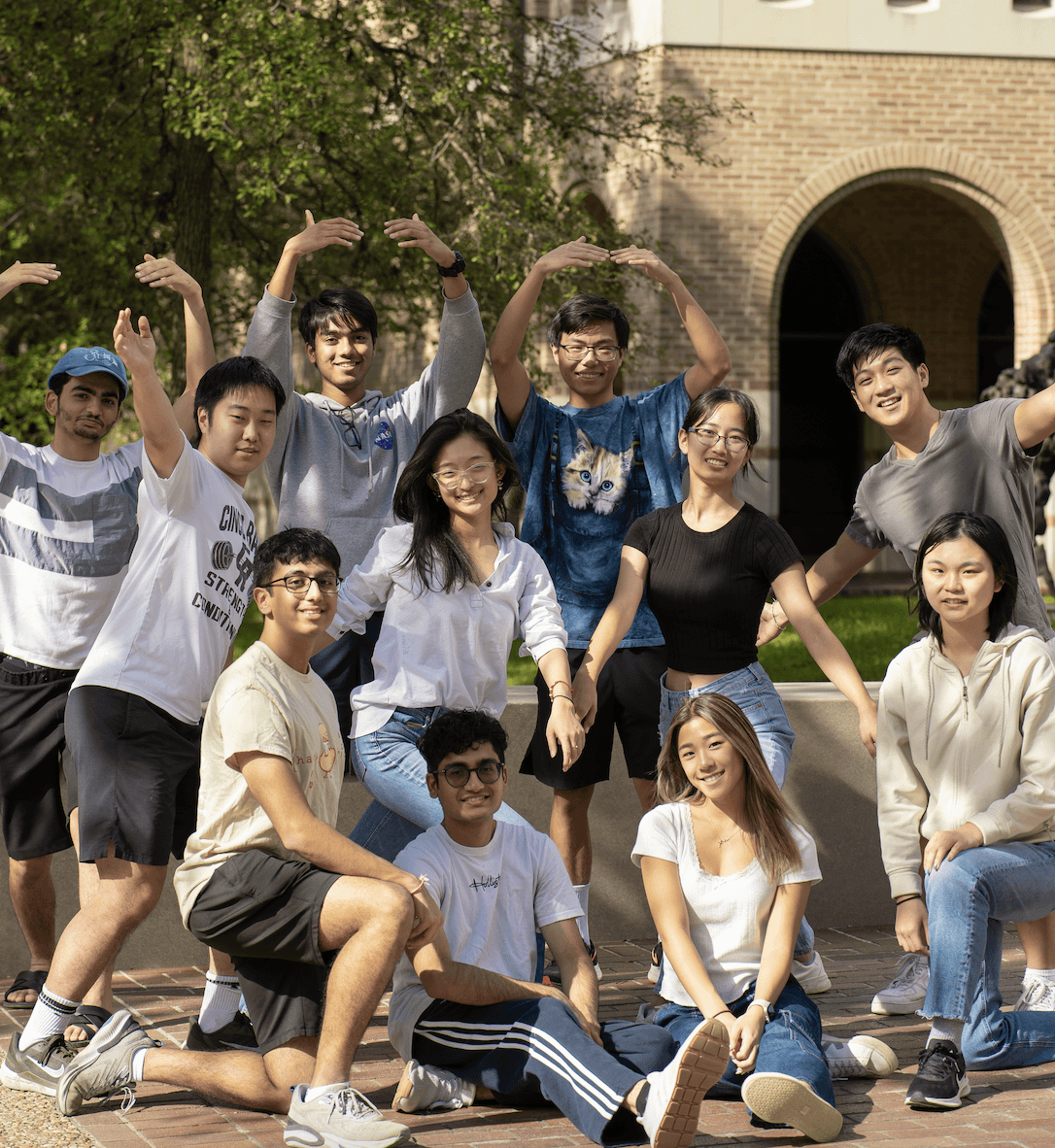
My 2023-2024 RiceApps team: Houston Ballet (slayers)! I love them to pieces.
My 2023-2024 RiceApps team: Houston Ballet (slayers)! I love them to pieces.
My 2023-2024 RiceApps team: Houston Ballet (slayers)! I love them to pieces.
My 2023-2024 RiceApps team: Houston Ballet (slayers)! I love them to pieces.

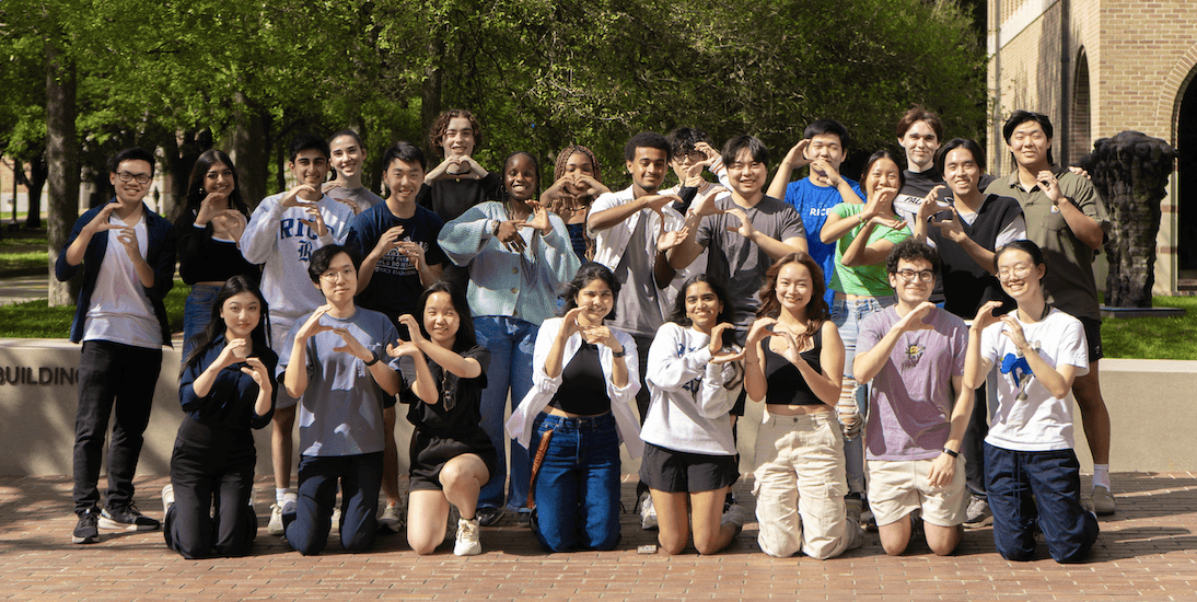
My RiceApps designers… I love them to pieces!
My RiceApps designers… I love them to pieces!
My RiceApps designers… I love them to pieces!
My RiceApps designers… I love them to pieces!
Maybe we can solve these problems with the tool that all of our designers are required to use… Figma. Although all of the designers are required to have Figma experience, most of our developers have never used it before and struggle with some pass-offs.
I’ve experienced these issues first hand as a design lead last year, and I was recently very blessed to become RiceApps’ Head of Design. I’m constantly looking out for my designers, so this problem has been in the back of my mind.
As a leader, teammate, and most importantly, designer, how we can better redesign Figma to be even more fit for cross collaboration?
Lucy, why Figma?
As mentioned above, we only have one designer per team! With only one designer among eight other technically-oriented teammates, we’ve had horror stories with team dynamics, conflicting timelines, and unsuccessful design pass-offs. What should be a place for collaboration has often been a rocky point of communication.
Maybe we can solve these problems with the tool that all of our designers are required to use… Figma. Although all of the designers are required to have Figma experience, most of our developers have never used it before and struggle with some pass-offs.
I’ve experienced these issues first hand as a design lead last year, and I was recently very blessed to become RiceApps’ Head of Design. I’m constantly looking out for my designers, so this problem has been in the back of my mind.
As a leader, teammate, and most importantly, designer, how we can better redesign Figma to be even more fit for cross collaboration?
Lucy, why Figma?
As mentioned above, we only have one designer per team! With only one designer among eight other technically-oriented teammates, we’ve had horror stories with team dynamics, conflicting timelines, and unsuccessful design pass-offs. What should be a place for collaboration has often been a rocky point of communication.
Maybe we can solve these problems with the tool that all of our designers are required to use… Figma. Although all of the designers are required to have Figma experience, most of our developers have never used it before and struggle with some pass-offs.
I’ve experienced these issues first hand as a design lead last year, and I was recently very blessed to become RiceApps’ Head of Design. I’m constantly looking out for my designers, so this problem has been in the back of my mind.
As a leader, teammate, and most importantly, designer, how we can better redesign Figma to be even more fit for cross collaboration?
FIGMA & THE INDUSTRY
What's Figma's mission?
Created in 2012, Figma was founded by two computer science students as a vision to “make design accessible to everyone.” Although I had originally viewed Figma as a design tool for designers, Figma emphasizes that they view themselves not just a design tool for traditional designers — they aim to be for anyone of any role or background to use.
Its Unique Features
Figma is a very competitive platform that's ranking incredibly well compared to its competitors (more on that later). Here's its most unique features:
Its Unique Features
Figma is a very competitive platform that's ranking incredibly well compared to its competitors (more on that later). Here's its most unique features:

Industry, Rankings, & Popularity…
We can’t properly do a Figma deep dive without understanding where it lies in terms of industry… and, truth be told, they’re doing great.
Figma currently ranks #1 in the Collaborative Design And Prototyping software market!
Figma with 38.60% market share
Adobe Premiere Pro CC (a video editing application, so not as applicable) with 20.73% market share
Adobe XD with 15.09% market share
With more research, the perspective of user experience designers — or designers in particular — Figma is the most popular tool by far: dominating statistics in UI design, prototyping, design systems, and UX design.


All graphics and information here are from UX Tool's 2023 Survey.
It’s pretty clear that Figma is dominating the industry it’s in… so much so that Adobe bought Figma in 2022.
But what about devs?
I, however, did not find anything that confirms the same for developers.
No matter how deep I digged on the internet, I couldn’t find any confirmation that Figma was a key tool for developers: only how to guides or informational introduction videos to Figma (which is better than nothing!) despite the fact that “developers account for a third of [Figma’s] users.”
Seems like although Figma is the most convenient tool for design hand-offs and is absolutely killing it in the design and collaboration industry, it still hasn’t 100% reached its mission of being the design tool for all. Put simply, there is a disconnect between Figma’s mission/target audience and its features.
Let's compare.
I decided to do a comparative analysis on specifically the built in dev-related tools some competitors offer.
Note that I did analysis not on the companies mentioned above in Figma’s industry, but on rather popular design tools that offered features for developers OR hand-off tools that offered features to help the hand-off process.
I first did comparative analysis on the companies and then reorganized them by feature (code generation, version control, asset exporting, presentation) to better see the differences between the three.
I first did comparative analysis on the companies and then reorganized them by feature (code generation, version control, asset exporting, presentation) to better see the differences between the three.

Here’s the information consolidated into a table:
Here’s the information consolidated into a table:

Figma’s very solid on almost all of the features I focused on. However, I was especially interested in their different presentations: though most of them offered the same features, the way they presented the information to the devs was completely different. I decided to focus on this.
Figma’s very solid on almost all of the features I focused on. However, I was especially interested in their different presentations: though most of them offered the same features, the way they presented the information to the devs was completely different. I decided to focus on this.
IDENTIFYING EXISTING PAIN POINTS
Figma's current design
Before heading straight to user testing or redesigning, I wanted to take a deeper dive into Figma’s interface and did a "secret shopper" approach to identifying any pain points myself! I quickly noted dev mode’s features and how we could learn from or improve upon them.
</>
Ready for Dev Status.
Ready for Dev Status.
Ready for Dev Status.
Ready for Dev Status.
Ready for Dev Status.

</>
the Dev Mode flow.
the Dev Mode flow.
the Dev Mode flow.
the Dev Mode flow.
the Dev Mode flow.
UNDERSTANDING OUR USERS
UNDERSTANDING OUR USERS
Onto Interviews!
As repeated from the research done above, we’ve confirmed that the user demographic for Figma is rather diverse: Figma is deemed to be a platform for anybody to design, interact with, and test their products. Thus, I wanted my user interviews to touch on these demographics: mainly those involved with the design to developer hand-off.
With that said, I had n=5 in person user interviews: 3 developers and 2 designers. All of these lovely participants were, again, from RiceApps (for more context, please see introduction)
Questions Asked
Because I wanted each question to vary based on the role of each interviewee, I had different questions for designers and developers. I also wanted to incorporate a real scenario in which they would interact with Figma itself to see how they experienced the interface.
Questions Asked
Because I wanted each question to vary based on the role of each interviewee, I had different questions for designers and developers. I also wanted to incorporate a real scenario in which they would interact with Figma itself to see how they experienced the interface.

Findings! Drumroll please….
After compiling the results onto Notion, I was shocked. The results were clear and so telling. Here’s what we know now from the stats:
Findings! Drumroll please….
After compiling the results onto Notion, I was shocked. The results were clear and so telling. Here’s what we know now from the stats:

INSIGHTS
INSIGHTS
What can we learn from this?
Dev Mode could be a game changer.
When I asked designers what their biggest hand-off concern was, they mentioned that developers would miss key features of the design that was included in Figma. When I asked developers what would make their hand-off easier, they basically described dev mode.
But it’s not… because developers don’t even know where/what dev mode is.
A decent amount of the developers didn’t know what dev mode was and NONE of them knew how to access it… which is why both designers and developers aren’t taking advantage of Dev Mode.
Problem: Figma’s dev mode is completely missing its target users due to lack of accessibility.
Problem: Figma’s dev mode is completely missing its target users due to lack of accessibility.
Opportunity: How can Figma invest into the awareness and usability of its Dev Mode feature to bridge its gap to one of its neglected target audiences: developers?
Opportunity: How can Figma invest into the awareness and usability of its Dev Mode feature to bridge its gap to one of its neglected target audiences: developers?
PROTOTYPING
PROTOTYPING
Brainstorming ideas…
After doing a deep dive Figma myself and confirming with my user research, there were two features in particular that I wanted to focus on: the 1) Ready for Dev status and 2) switching on and off dev mode.
Although these two features didn't seem like a lot, it was incredibly difficult thinking about redesigns. There were so many different ways I could change each feature (up to the icon to the placement), so I did a braindump of all of my ideas before even touching Figma.
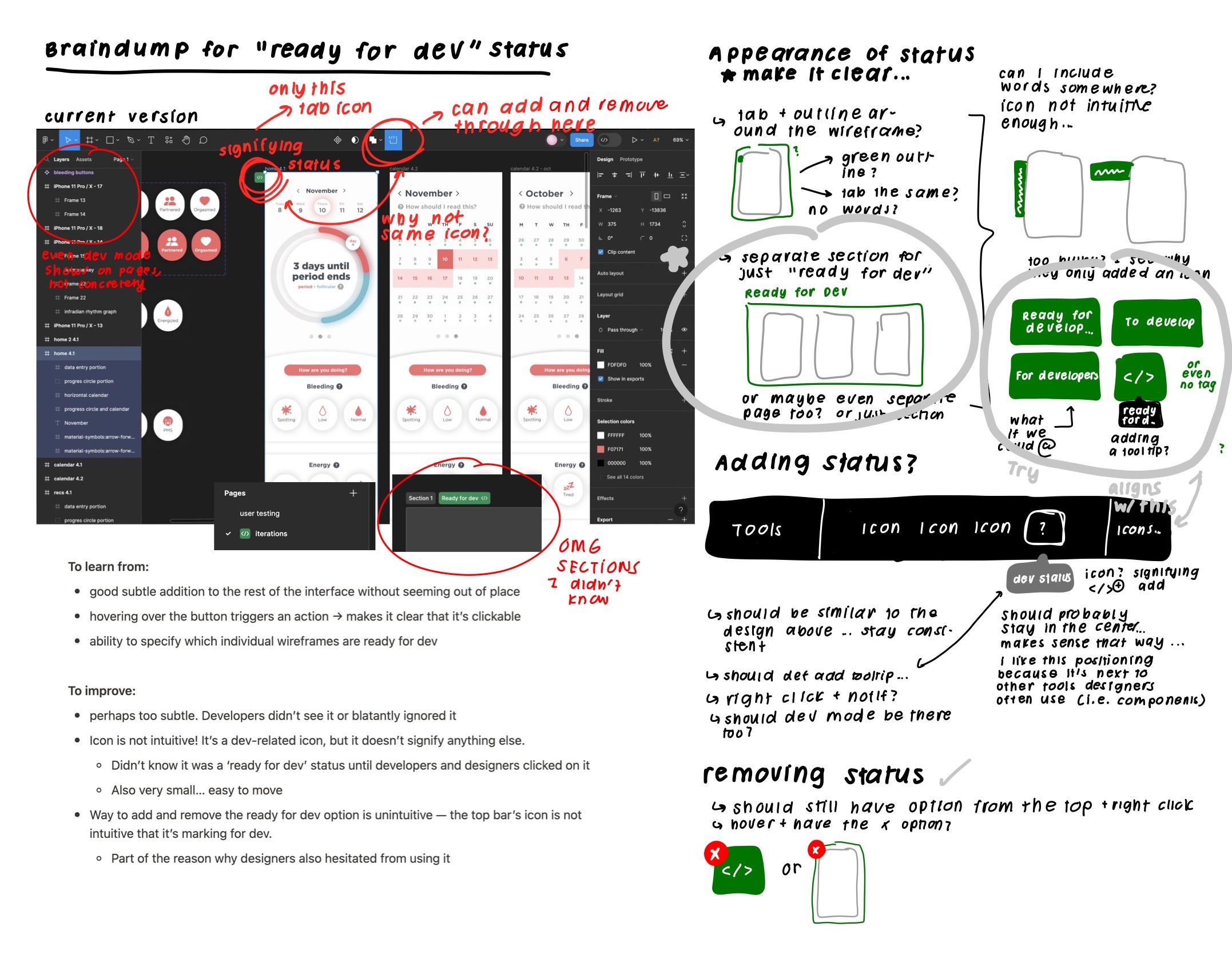
A braindump for the "ready for dev" status: keeping icons, locations, and appearance in mind.

A braindump for dev mode — keeping in mind how to turn it off and on!
After the brain-dump, I picked out the 1) most doable and 2) most accessible ideas to implement onto Figma. There were so many designs from the brain-dump that I had to create multiple versions for different features:
After the brain-dump, I picked out the 1) most doable and 2) most accessible ideas to implement onto Figma. There were so many designs from the brain-dump that I had to create multiple versions for different features:
After the brain-dump, I picked out the 1) most doable and 2) most accessible ideas to implement onto Figma. There were so many designs from the brain-dump that I had to create multiple versions for different features:
After the brain-dump, I picked out the 1) most doable and 2) most accessible ideas to implement onto Figma. There were so many designs from the brain-dump that I had to create multiple versions for different features:
After the brain-dump, I picked out the 1) most doable and 2) most accessible ideas to implement onto Figma. There were so many designs from the brain-dump that I had to create multiple versions for different features:
After the brain-dump, I picked out the 1) most doable and 2) most accessible ideas to implement onto Figma. There were so many designs from the brain-dump that I had to create multiple versions for different features:
After the brain-dump, I picked out the 1) most doable and 2) most accessible ideas to implement onto Figma. There were so many designs from the brain-dump that I had to create multiple versions for different features:
After the brain-dump, I picked out the 1) most doable and 2) most accessible ideas to implement onto Figma. There were so many designs from the brain-dump that I had to create multiple versions for different features:
Appearance of "Ready For Dev" Status
Appearance of "Ready For Dev" Status
Appearance of "Ready For Dev" Status
Appearance of "Ready For Dev" Status
Appearance of "Ready For Dev" Status
Appearance of "Ready For Dev" Status
Appearance of "Ready For Dev" Status
Appearance of "Ready For Dev" Status

My iterations/ideas for the "ready for dev" status: one with words (both vertical and horizontal) and another with a tooltip to clarify what the icon is.
Idea 1: Word-based identifier

A close up of using words instead of icons for the ready for dev status. Tried both vertical and horizontal formats and different words.
Idea 2: Icon with Tooltip

A close up of using tools to clarify what the status was. Was also playing around with the colors and wording
Locating Wireframes that are "Ready for Dev"
Note that all three wireframes also have a separate page that contains pages that are ready for dev. This separate page (created automatically) is pinned to the top just for devs: it will only contain the wireframes that need to be implemented.
Locating Wireframes that are "Ready for Dev"
Note that all three wireframes also have a separate page that contains pages that are ready for dev. This separate page (created automatically) is pinned to the top just for devs: it will only contain the wireframes that need to be implemented.
Locating Wireframes that are "Ready for Dev"
Note that all three wireframes also have a separate page that contains pages that are ready for dev. This separate page (created automatically) is pinned to the top just for devs: it will only contain the wireframes that need to be implemented.
Locating Wireframes that are "Ready for Dev"
Note that all three wireframes also have a separate page that contains pages that are ready for dev. This separate page (created automatically) is pinned to the top just for devs: it will only contain the wireframes that need to be implemented.
Locating Wireframes that are "Ready for Dev"
Note that all three wireframes also have a separate page that contains pages that are ready for dev. This separate page (created automatically) is pinned to the top just for devs: it will only contain the wireframes that need to be implemented.
Locating Wireframes that are "Ready for Dev"
Note that all three wireframes also have a separate page that contains pages that are ready for dev. This separate page (created automatically) is pinned to the top just for devs: it will only contain the wireframes that need to be implemented.
Locating Wireframes that are "Ready for Dev"
Note that all three wireframes also have a separate page that contains pages that are ready for dev. This separate page (created automatically) is pinned to the top just for devs: it will only contain the wireframes that need to be implemented.
Locating Wireframes that are "Ready for Dev"
Note that all three wireframes also have a separate page that contains pages that are ready for dev. This separate page (created automatically) is pinned to the top just for devs: it will only contain the wireframes that need to be implemented.
Idea 1: Ready wireframes with an icon and outline.
A close up of using icons and an outline to locate the wireframes that are ready for dev.
Idea 2: Ready wireframes into sections.

A close up of having a section to easily locate the wireframes that are ready for dev..
Idea 3: Ready wireframes into icons.

A close up of only using icons to locate the wireframes that are ready for dev.
Turning on and off dev mode
Turning on and off dev mode
Turning on and off dev mode
Turning on and off dev mode
Turning on and off dev mode
Turning on and off dev mode
Turning on and off dev mode
Turning on and off dev mode
Idea 1: Dev Toggle centered in the top bar.

A close up of having the toggle centered on the top bar.
Idea 2: Dev Toggle right aligned in the top bar.

A close up of having the toggle right aligned on the top bar.
Idea 3: Dev (word-based) drop-down centered in the top bar.

A close up of having centered a drop down on the top bar.
UNDERSTANDING OUR USERS (AGAIN)
UNDERSTANDING OUR USERS (AGAIN)
Back to User Testing!
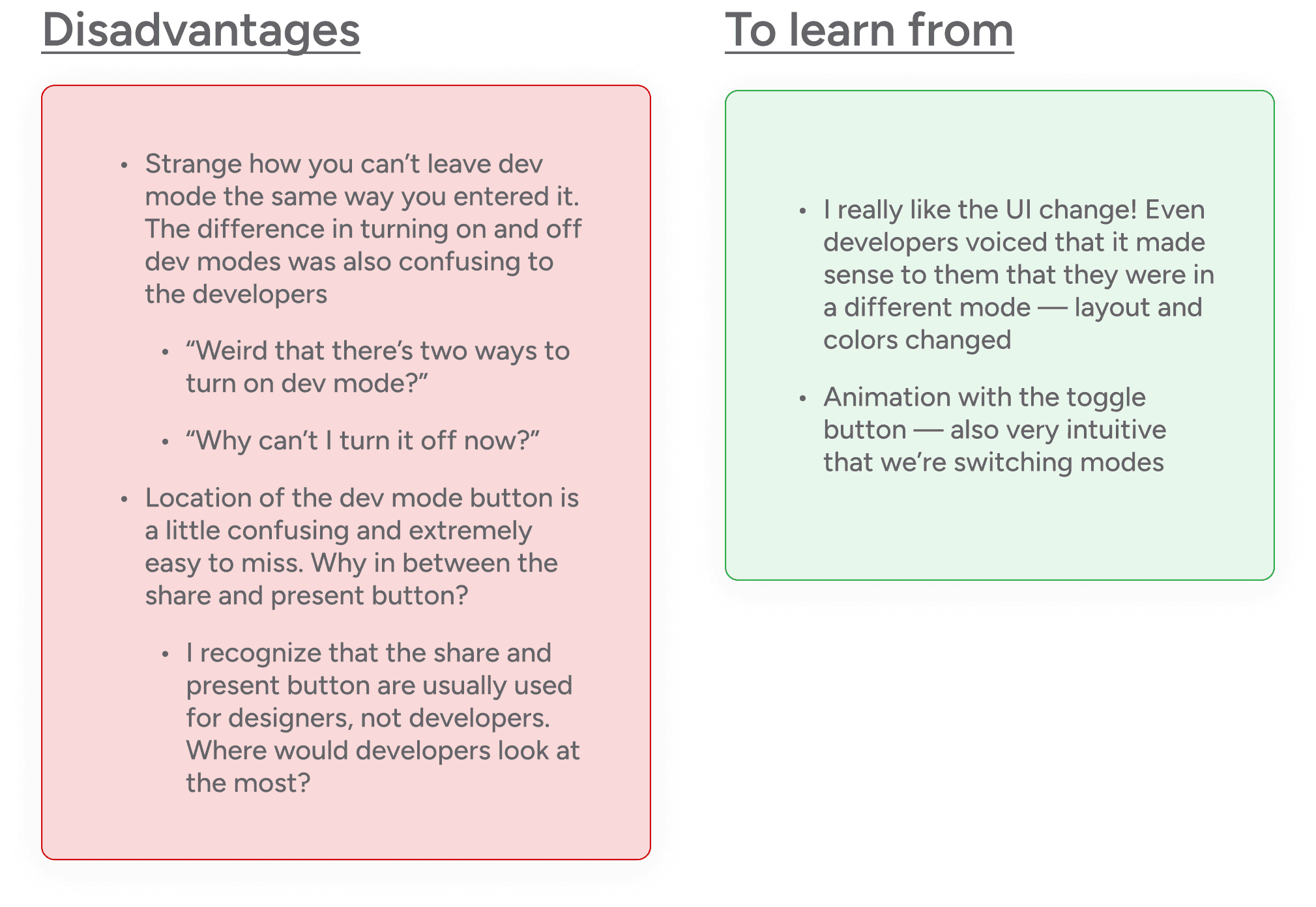
After creating these prototypes, I wanted to run them by my interviewees again to see which prototypes they preferred, what ideas they had, and if my designs even solved the original issue. Here’s what they liked and didn’t like:
Back to User Testing!
After creating these prototypes, I wanted to run them by my interviewees again to see which prototypes they preferred, what ideas they had, and if my designs even solved the original issue. Here’s what they liked and didn’t like:

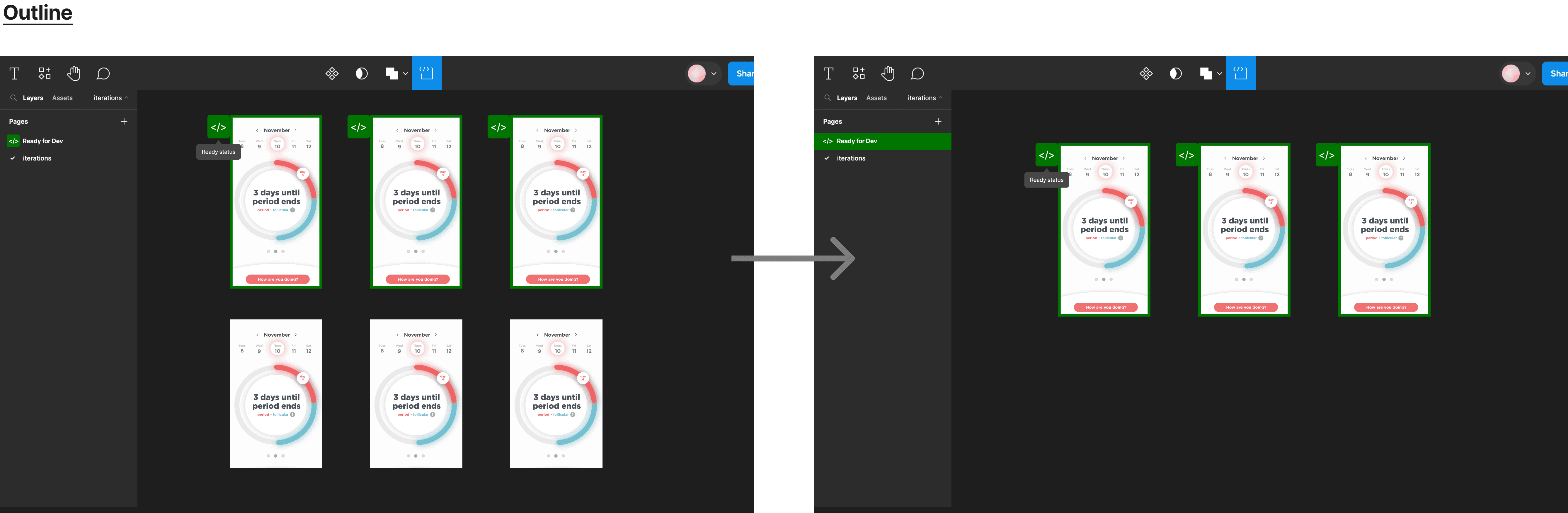
And with that said, I used their feedback to create the final designs!
And with that said, I used their feedback to create the final designs!

A screenshot of my Figma iterations after the final user research! I now know exactly what to include for the final iteration.
Figma Dev Mode </>:
The Redesign
Curious over the final redesign? Take a look here.
Figma Dev Mode </>:
The Redesign
Curious over the final redesign? Take a look here.
Appearance of the "ready for dev" status. Added a tooltip — whenever you hover over the status, it clearly states what the role of the icon is. Removing and adding this status remains the same.
Locating the wireframes ready for dev! On top of the icon with the tooltip, the ready wireframes also have a green outline around them. Developers can also easily find the wireframes all at once in the "Ready for Dev" page: only the ready wireframes are there.
Turning dev mode on and off. Easily switch between modes with a word-based drop-down (with icons)! You can now also turn off dev-mode the same way you turned it on through the icon.
Why is this redesign worth investing in?
Why is this redesign worth investing in?
Let's go back to Figma's mission: 'Our vision is to make design accessible to everyone.' This central principle is making a huge mark on the design industry, but we also have to keep in mind of their diverse user base: a significant portion of which, about a third, comprises developers.
Although Figma is an incredible and competitive company, my user testing showed a huge gap in Figma's product and its alignment with their mission/user demographic. Dev mode, made just for developers, isn't reaching the developers nor users who are desperately in need of such feature. After all, why invest such resources into developing this feature if it's not being used? By improving the experience and accessibility of this feature, we can actually help users take more advantage of this tool provided to them.
Also, as this target demographic — developers — make up over a third of their users, Figma can only gain from this improvement. Making dev mode more accessible could 1) broaden their user base, appealing to a wider demographic, 2) extend their market reach beyond traditional design teams to encompass development teams as well, opening new revenue streams, and 3) enforce their competitive position not only in the design industry, but also establish a stronger foothold in the software industry! The better the user experience is for developers in Figma, the more likely it is for increased usage and recommendations among their peers: boosting Figma's profitability and market presence.
So... what did I learn?
Even the smallest redesigns require so. Much. Thinking. When I was first redesigning this feature, I was overly ambitious and thought about redesigning Figma's entire dev mode. I quickly realized this was a bad idea (HAHA): I wanted to put lots of effort and care into every choice I made rather than make broad changes that didn't improve the interface as much. Less is more!
I love my user interviewees. Aside from the interviewees being so considerate and willing to spend their time with me, I was so, so impressed over their feedback. I learned so much from just talking to them, and it opened my eyes to 1) areas of the OG design I didn't notice and 2) prototypes I could improve on that I didn't even think of. I learned so much, forever grateful for them!
Business and design go hand-in-hand. Although I love and dabble with entrepreneurship, this was my first time intentionally thinking about the business aspect of my design decisions. I love seeing how even the simplest of design decisions can impact a business model, and this mindset will stay with me the more I design and the more I create.
Even the smallest redesigns require so. Much. Thinking. When I was first redesigning this feature, I was overly ambitious and thought about redesigning Figma's entire dev mode. I quickly realized this was a bad idea (HAHA): I wanted to put lots of effort and care into every choice I made rather than make broad changes that didn't improve the interface as much. Less is more!
I love my user interviewees. Aside from being so considerate and willing to spend their time with me, I was so, so impressed over their feedback. I learned so much from just talking to them, and it opened my eyes to 1) areas of the OG design I didn't notice and 2) prototypes I could improve on that I didn't even think of. I learned so much, forever grateful for them!
Business and design go hand-in-hand. Although I love and dabble with entrepreneurship, this was my first time intentionally thinking about the business aspect of my design decisions. I love seeing how even the simplest of design decisions can impact a business model, and this mindset will stay with me the more I design and the more I create.
© 2024 by Lucy Han. Created with this playlist on repeat ᕕ( ᐛ )ᕗ
© 2024 by Lucy Han. Created with this playlist on repeat ᕕ( ᐛ )ᕗ
© 2024 by Lucy Han. Created with this playlist on repeat ᕕ( ᐛ )ᕗ
© 2024 by Lucy Han. Created with this playlist on repeat ᕕ( ᐛ )ᕗ
© 2024 by Lucy Han. Created with this playlist on repeat ᕕ( ᐛ )ᕗ
© 2024 by Lucy Han. Created with this playlist on repeat ᕕ( ᐛ )ᕗ
© 2024 by Lucy Han. Created with this playlist on repeat ᕕ( ᐛ )ᕗ
